Stock market charts represent the Historical data of any company’s price and trading volume over a certain period of time. The charts are used by Traders and investors to analyze past and current price trends and identify patterns and indicators that help trading decisions.

Here are many types of charts used in the Stock market:-
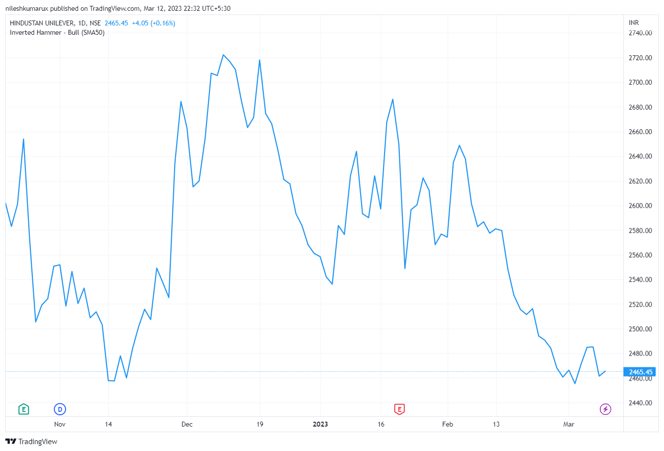
- Line Chart: This is the basic type of chart used in stock trading, representing the closing price of a security over time with a simple line. This is a two-dimensional chart with an X and Y axis, each point representing a single value.
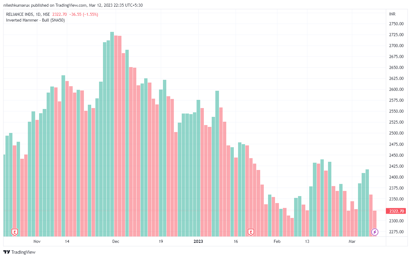
- Bar Chart: Bar charts represent price data using vertical bars, with each bar showing the open, high, low, and closing prices for a given time period. It’s rectangular bars with heights or lengths proportional to the values that they represent.
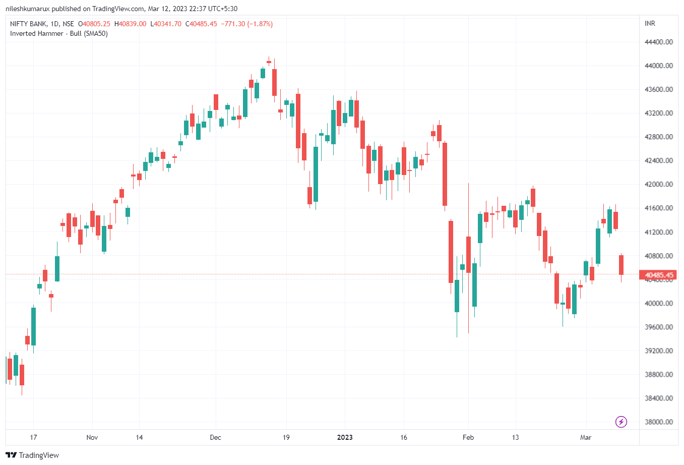
- Candlestick Chart: The candlestick charts display open, high, low, and closing prices for a given time period. The candlestick chart shows the range between the open and closing price, with the color of the bar indicating whether the stock price rose or fell during that time period.
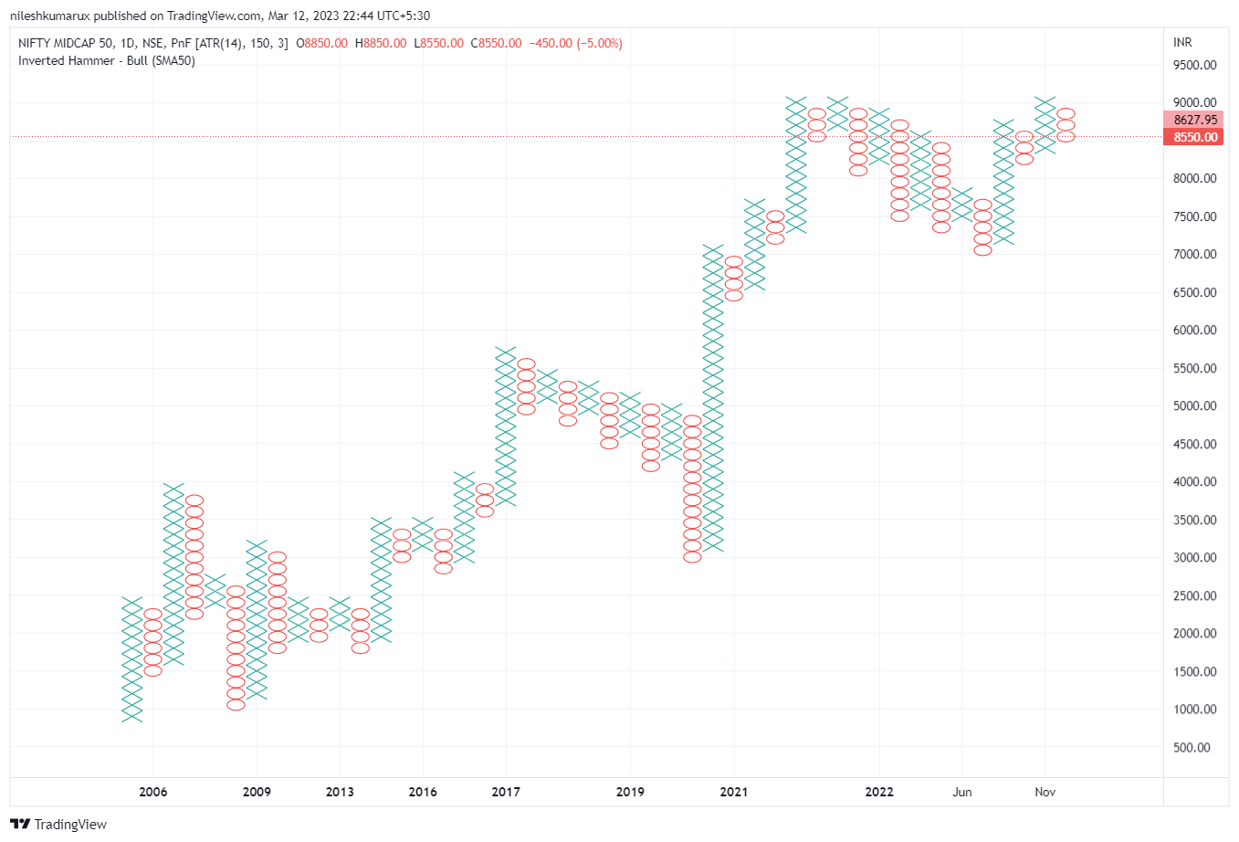
- Point and Figure Chart: This chart type is based on changes in price rather than time. It uses X’s and O’s to represent upward and downward price movements and is used primarily by technical analysts to identify trends and reversals.
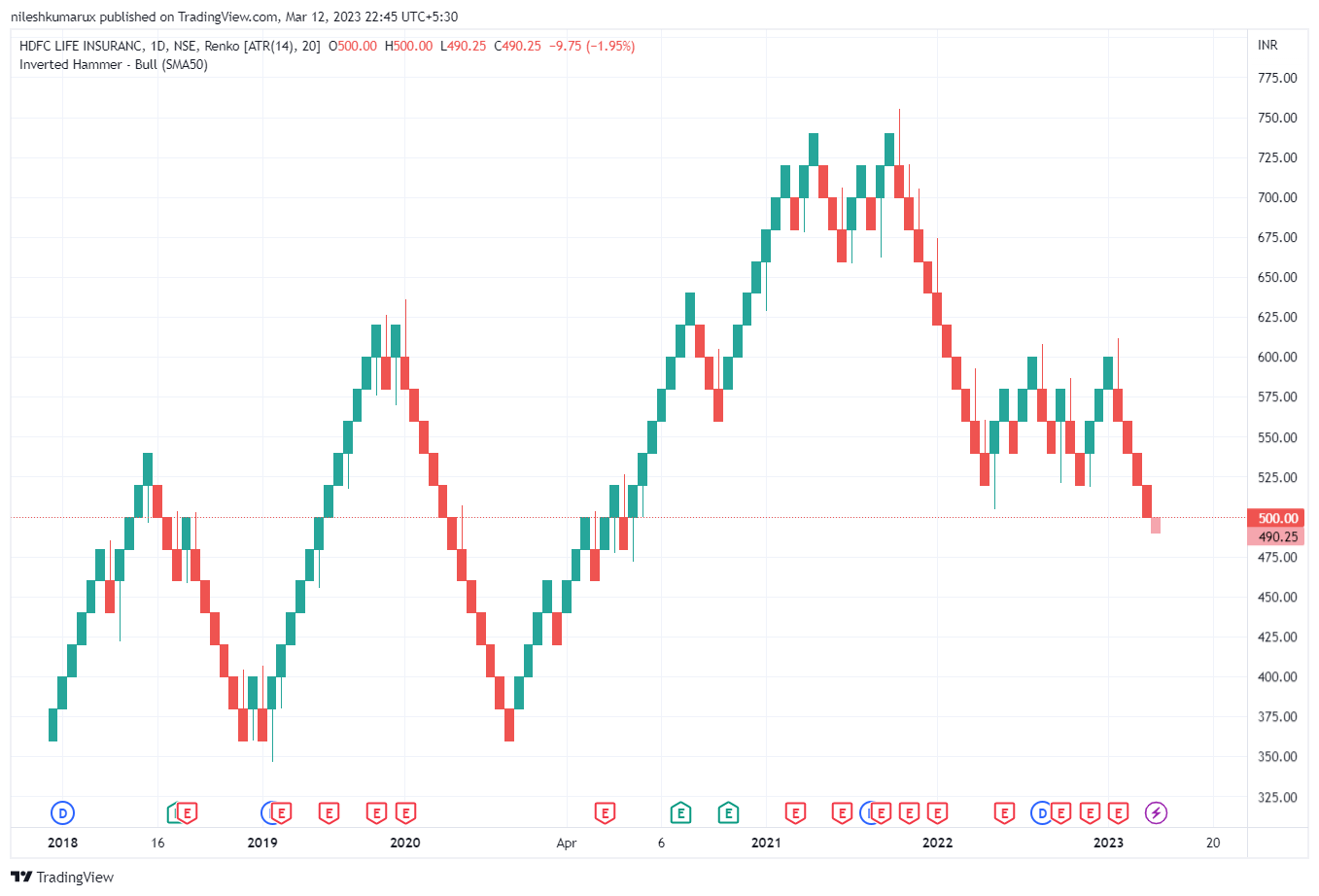
- Renko Chart: Renko charts are similar to point and figure charts in that they are based on price changes rather than time. They use bricks or blocks to represent price movements of a certain magnitude, ignoring price changes below that threshold.
Example of a Chart in the Stock market
Let’s see examples of different types of charts in Technical analysis.
Line Chart
Bar Chart
Candlestick Chart
Point and Figure Chart
Renko Chart
Do comment if you have any doubts or suggestions on this Basic Technical topic.
Disclaimer: All comapny chart are used only for learing purpose. There is no buy and sell recommandtion. All Technical analyst are learing purpose only.